O’Keeffe Shoes: Brand identity and communications
As lead creative and strategist for O’Keeffe Shoes, I worked from start up with Creative Director Maud O’Keeffe to shape a new footwear brand that blends luxury Italian craftsmanship with Irish heritage. I directed a team of designers and copywriters to build the identity, define the positioning and create the core communications that would introduce O’Keeffe to a competitive luxury market.


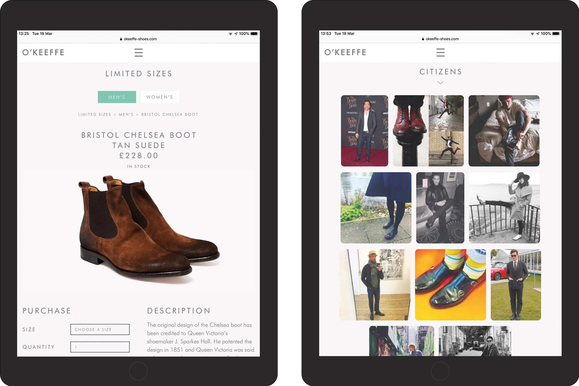
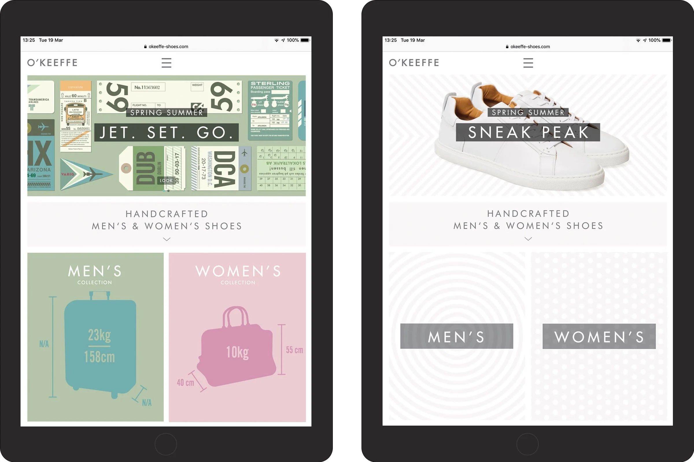
Summary

-
O’Keeffe set out to create a modern luxury shoe brand with a distinct point of view. The brief was to:
Express the mix of Italian making and Irish roots in a clear, contemporary way
Balance craft, comfort and character without feeling nostalgic or old fashioned
Work across packaging, retail and early digital touchpoints
Give the brand a strategic foundation that could guide future ranges and campaigns
The challenge was to build a brand world that felt premium and design led, while still approachable for customers discovering O’Keeffe for the first time.
-
I partnered closely with Maud O’Keeffe to articulate the creative vision and turn it into a usable brand platform. We mapped out the core story around considered design, exceptional construction and a quiet sense of Irish wit.
From there I led the team through routes that treated O’Keeffe as a modern classic rather than a traditional heritage label. We tested typography, colour and illustration directly on key applications such as boxes, tissue, swing tags and launch collateral, so decisions were made in context rather than on abstract moodboards.
Alongside the visuals I acted as brand strategist, advising on positioning, key messages and tone of voice to ensure the identity and communications were pulling in the same direction.
-
The identity system is built around three main pillars:
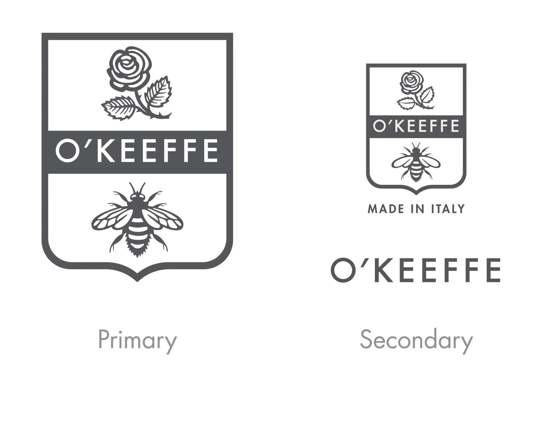
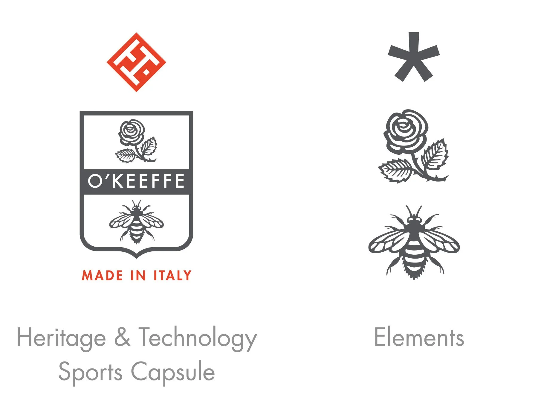
1. Wordmark and typography
A distinctive wordmark paired with a clear type hierarchy that handles everything from product information to long form storytelling. The typography has enough character to feel ownable, while remaining legible across small labels and print.2. Colour and graphic language
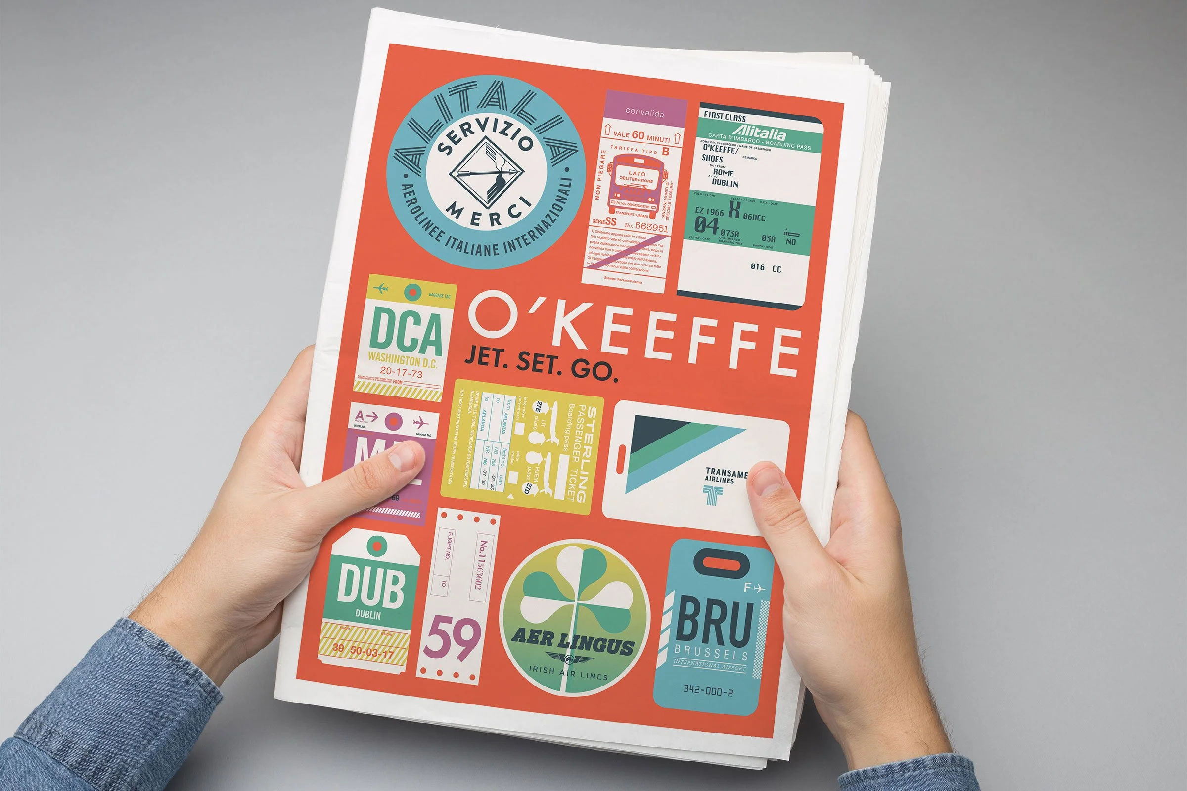
A palette that nods to both Italian leather tones and Irish landscape colours, used with restraint so the shoes remain the hero. Simple graphic devices and stamps reference travel and provenance, creating a recognisable language that can flex across collections and seasons. The collage style ticket artwork you use in your overview PDF is a great example of this in practice.3. Communications and storytelling
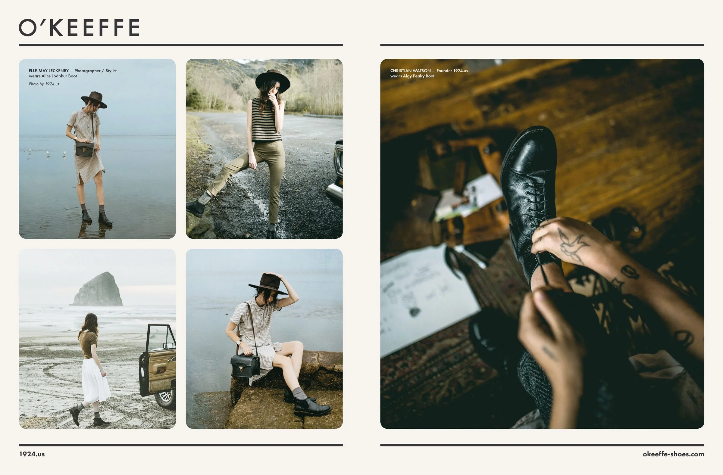
Short, confident lines and product naming that carry a subtle sense of place and personality. Visual guidelines cover photography and layout so lookbooks, digital assets and point of sale all feel part of the same world. -
The collaboration had a lasting impact on the business, both visually and strategically. In Maud O’Keeffe’s words:
“You have become my ideal design partner. You understood the O’Keeffe creative vision immediately, and were able to translate this into a design reality. Any brand that appreciates the craft of design would do well to employ you as their creative lead.”
The work:
Established a clear, differentiated brand from launch
Gave O’Keeffe a cohesive presence across packaging, retail and communications
Provided a strategic and creative foundation that could support new ranges and ongoing storytelling
This case study neatly reinforces your strengths in Brand Foundations and Campaigns and Communication, and gives you rich imagery for both sections. If you like, next I can write a one-sentence O’Keeffe line for the “Brand Foundations” Focus page so it plugs into that narrative too.

Any brand that appreciates the craft of design would do well to employ you as their creative lead.”
Maud O’Keeffe, Managing Director