Rory McEwen: A New Perspective on Nature
Designing Legacy for America’s First Botanical Art Retrospective
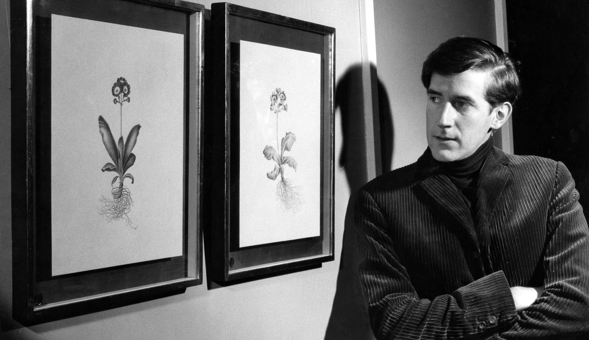
I partnered with the Estate of Rory McEwen to create the definitive visual identity for the first major American retrospective of the renowned Scottish botanical artist (1932-1982). McEwen brought a modern sensibility to botanical art, developing a distinctive style painting on vellum with large empty backgrounds on which his plant portraits seem to float.
This was the American debut of a master whose work is held in prestigious collections including the Scottish National Gallery and who remains the only botanical artist to be given a solo exhibition at the Serpentine Gallery. Working directly with the McEwen family and curatorial teams, I translated the quiet intensity and scientific precision of his celebrated vellum paintings into a cohesive brand experience for four prestigious American institutions over two years.
Summary

-
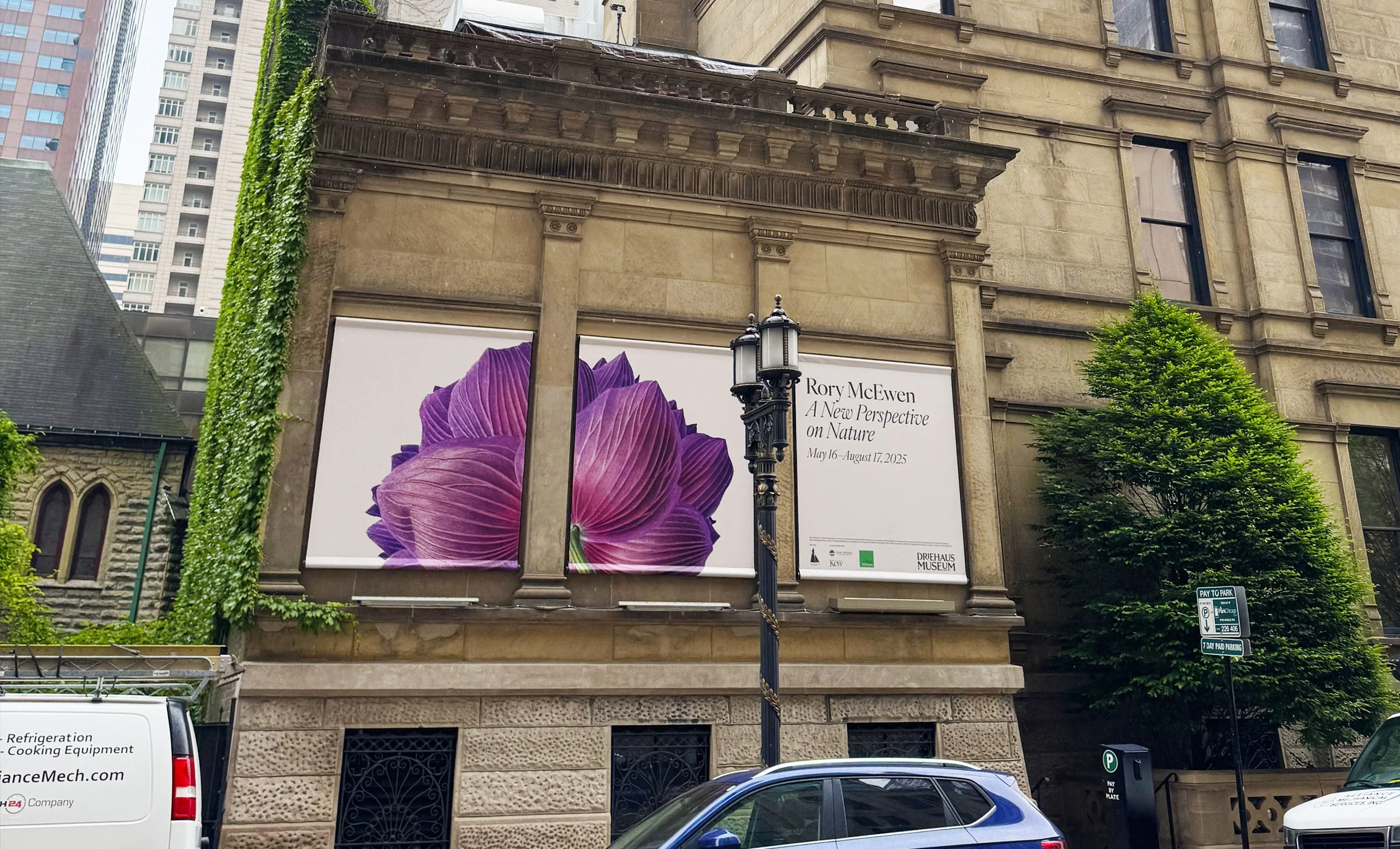
The Estate required a comprehensive visual identity for a four-venue American tour spanning 2024-2025: Gibbes Museum of Art (Charleston), Davis Museum at Wellesley College, The Society of the Four Arts (Palm Beach), and Driehaus Museum (Chicago). Each institution needed to embrace our system while honoring McEwen’s refined aesthetic and introducing American audiences to his internationally recognized work.
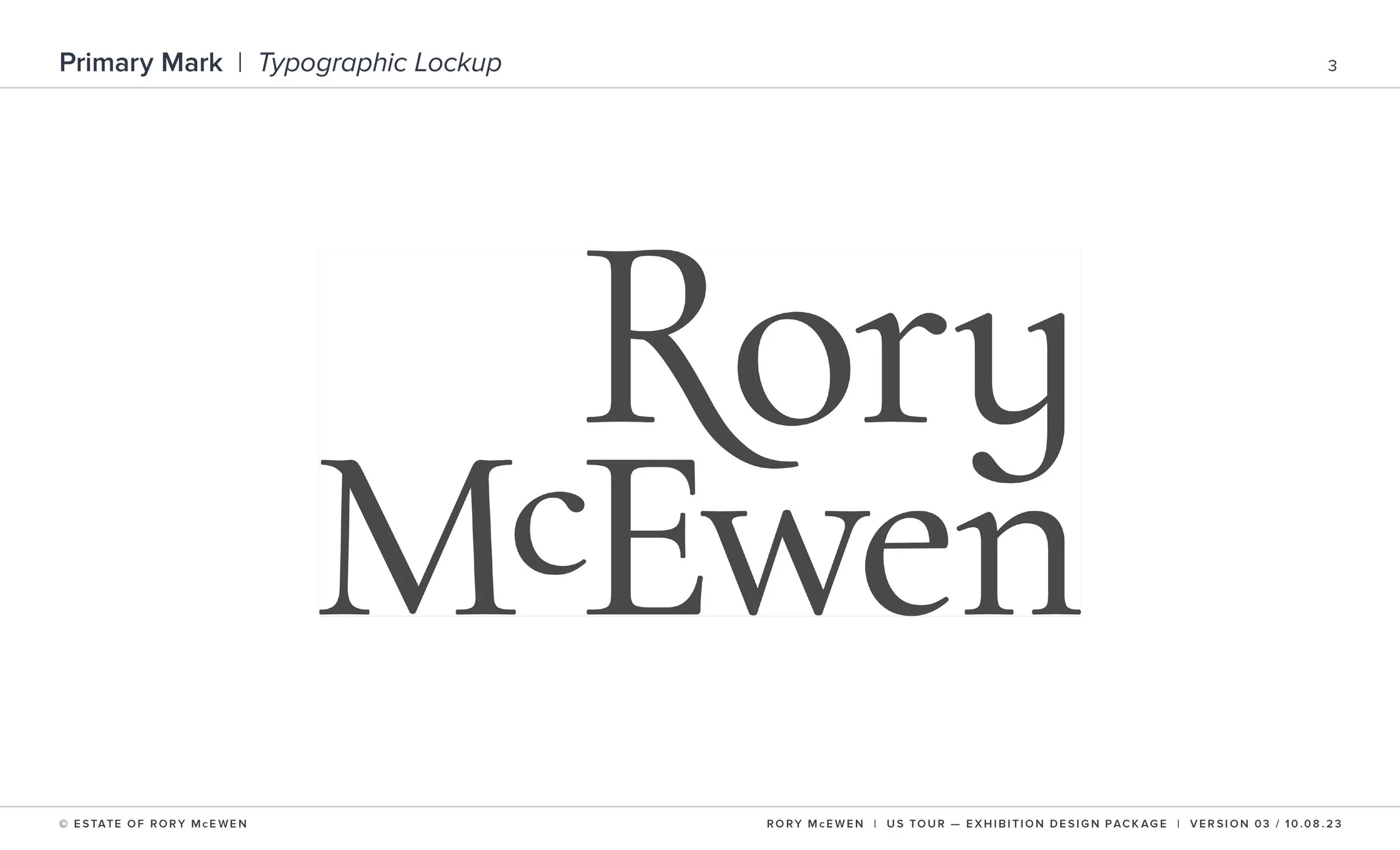
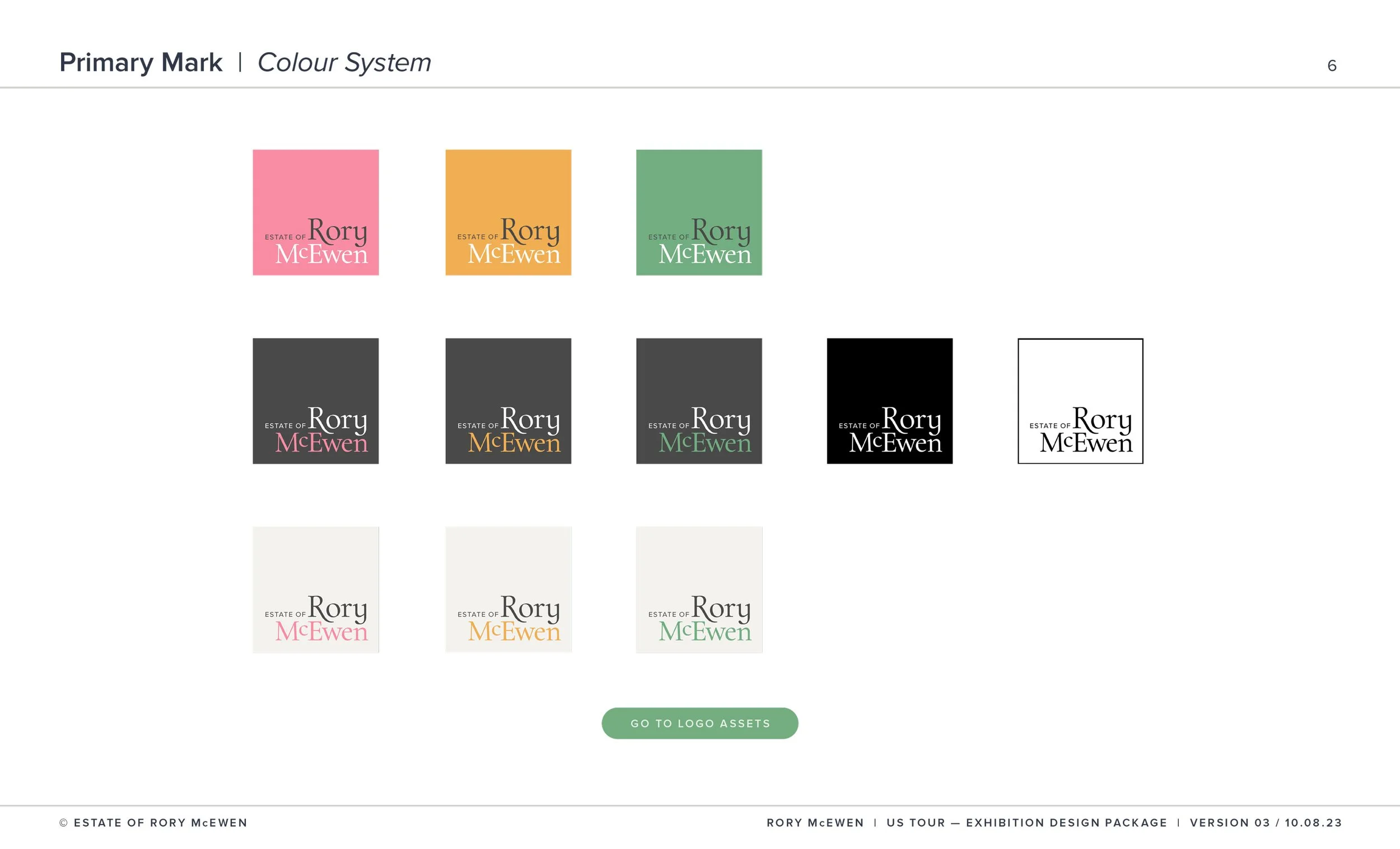
Central to this was developing a definitive logo with ownership transferring to the Estate, serving both the exhibition tour and as their ongoing visual identity, extending McEwen’s legacy beyond the retrospective.
-
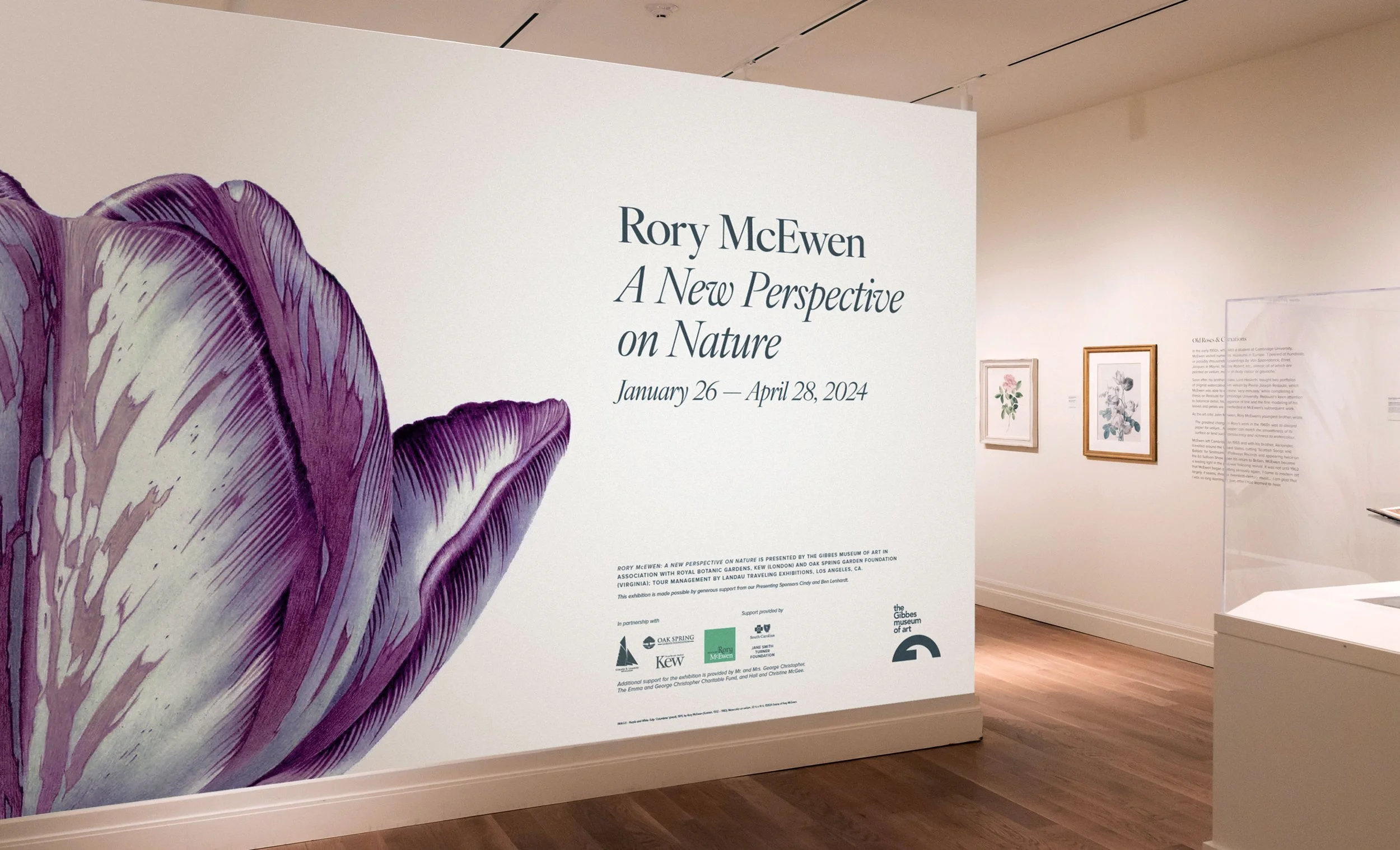
Drawing from McEwen’s revolutionary technique, I developed a design philosophy of “refined restraint”—centering on the interplay between presence and absence that defines his celebrated work. Beyond identity, I collaborated with curatorial teams on spatial design, developing hanging plans that honored McEwen’s meditative viewing experience.
-
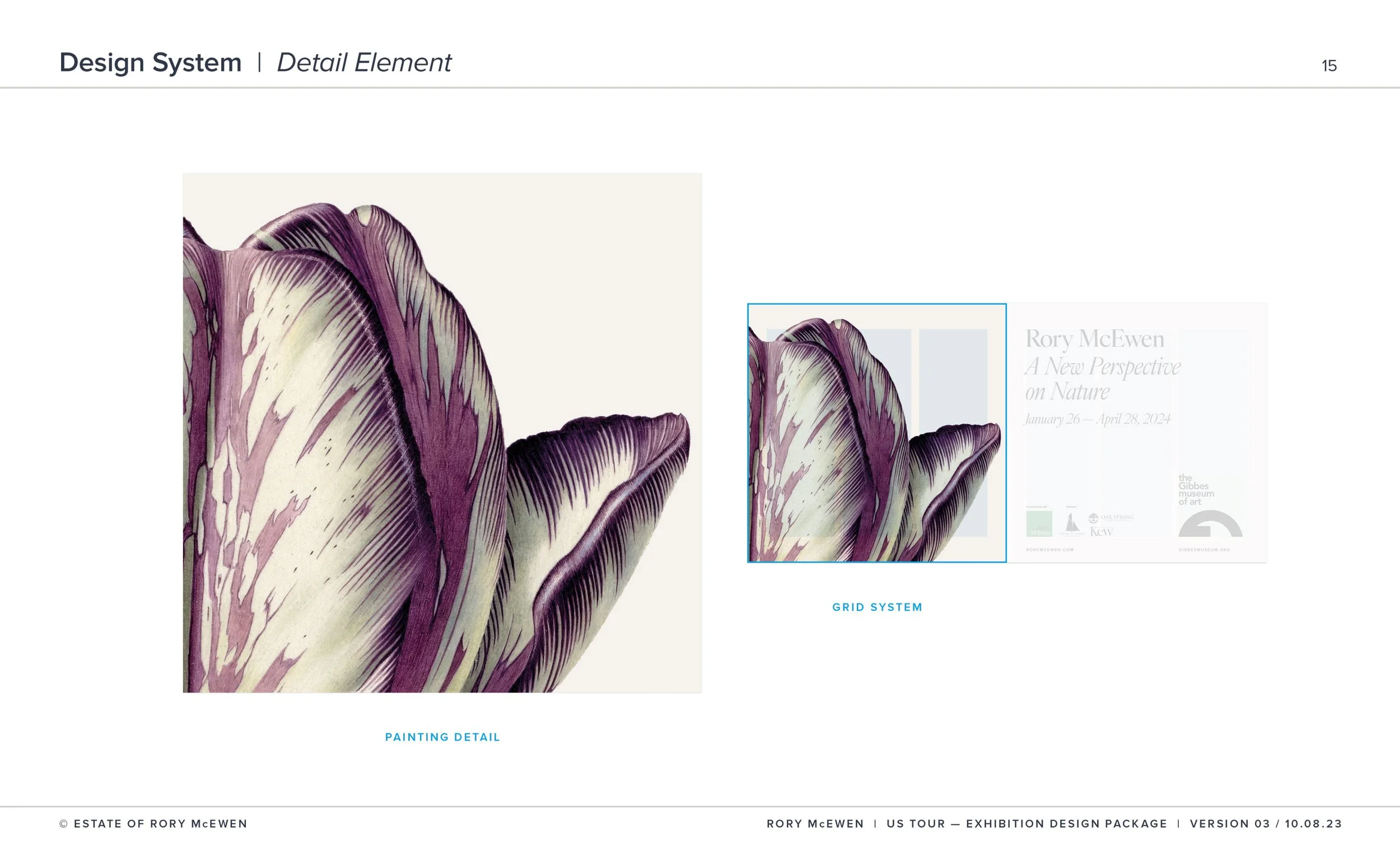
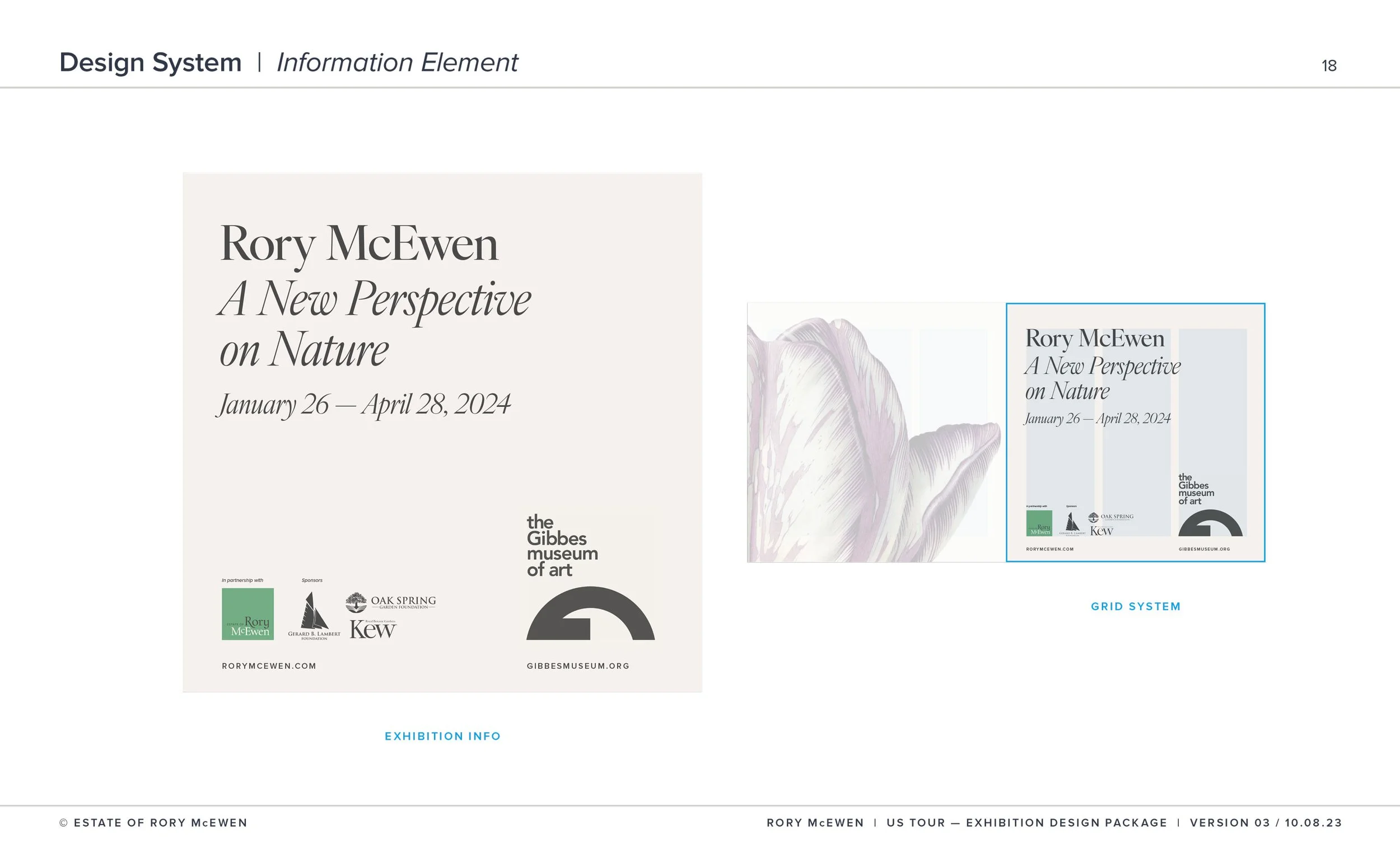
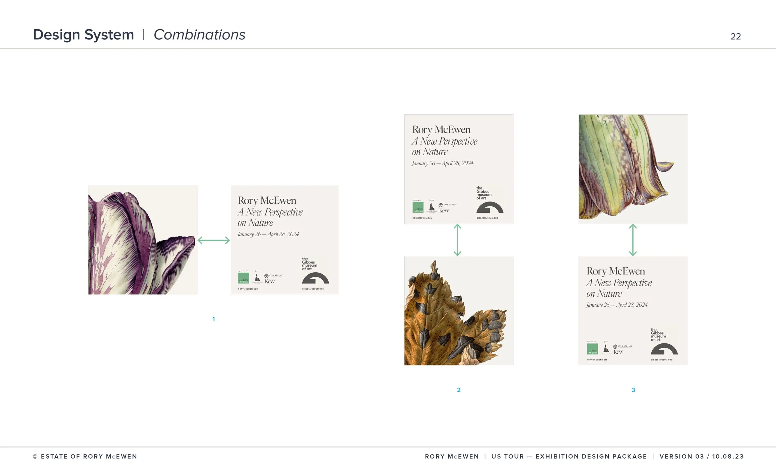
I was intrigued by the extraordinary detail in Rory’s work, which inspired me to explore enlarging the paintings to reveal the intricate precision often missed at standard viewing size. Ivyora Display’s organic elegance paired with Proxima Nova's contemporary clarity created a typography hierarchy that mirrors McEwen’s movement from broad composition to minute detail. The color palette—cream vellum, charcoal depths, soft botanicals—was extracted directly from his paintings, embodying his philosophy of scientific precision wrapped in poetic restraint.
-
The tour achieved universal adoption—all four venues embraced our complete system without modification, testament to both its flexibility and authentic connection to McEwen’s established artistic vision. The identity successfully presented this master’s work to American audiences, with attendance exceeding projections at each venue.
The Estate now possesses a definitive visual language that honors his legacy while positioning his renowned work for continued international recognition.

Your designs are so ravishing, of course all the museums want to use them.”
Christabel Holland, Daughter of the artist